Cemetery
Parque dasOrquídeas
A brand created to hold memories with serenity.
↓(01)THE CHALLENGE
Express warmth without losing solemnity.
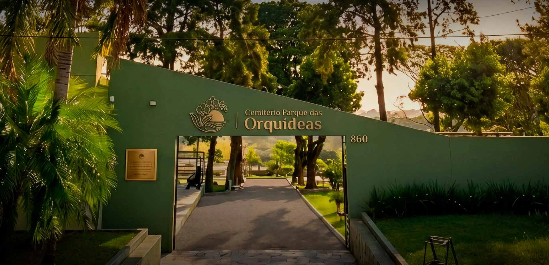
Parque das Orquídeas needed an identity able to communicate care at a delicate moment. We started with the site’s genuine connection to nature to build a serene, respectful and approachable brand.
- Client
- Cemitério Parque das Orquídeas
- Scope
- Strategy + visual identity
- Concept
- Warmth, serenity and peace
- Creative
- Creare Comunica + @vitohiro
(02)THE CENTRAL IDEA
Memory also deserves to be cared for with beauty.
(03)THE SYMBOL
Nature, farewell and continuity.
01
OrchidsDelicacy, memory and warmth.
02
LeavesA direct link to the park cemetery concept.
03
SunsetSerenity, rest and a peaceful farewell.
(04)VISUAL SYSTEM
Solid at heart. Gentle in presence.
Park green#36561A
Sunset#E9C244
Serene light#E5E3AE
Breathing room#F5F5F5
Sobriety#030303
Primary mark
Philosopher
Elegance · memory · sensitivitySupporting text
Sora
Clarity · modernity · legibility(05)THE BRAND IN USE
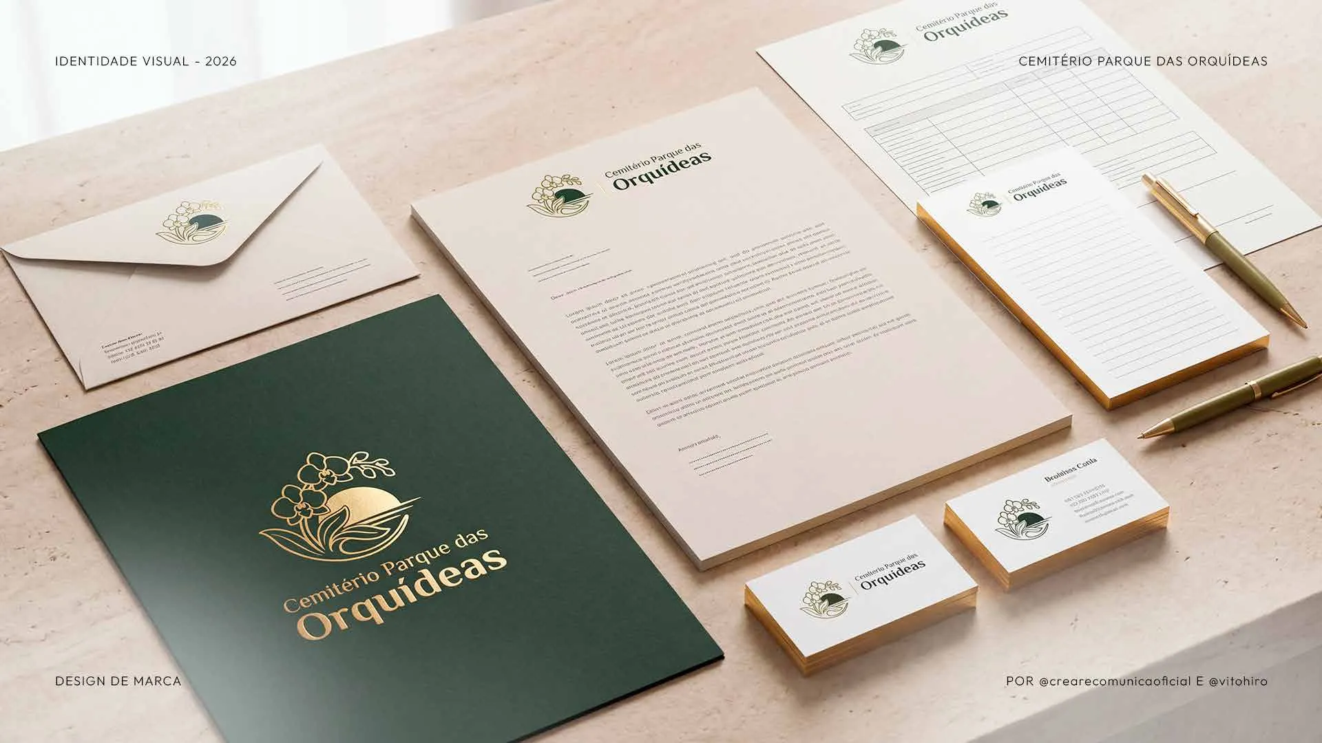
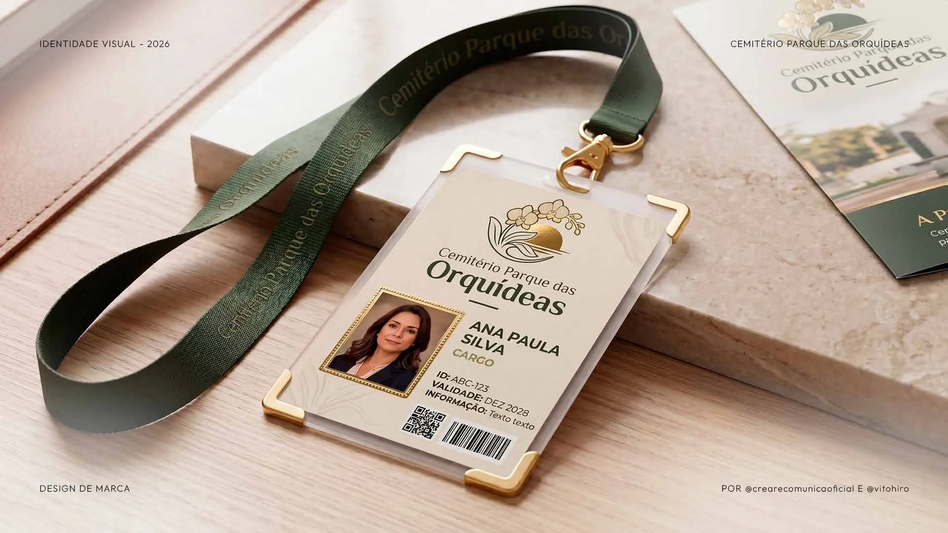
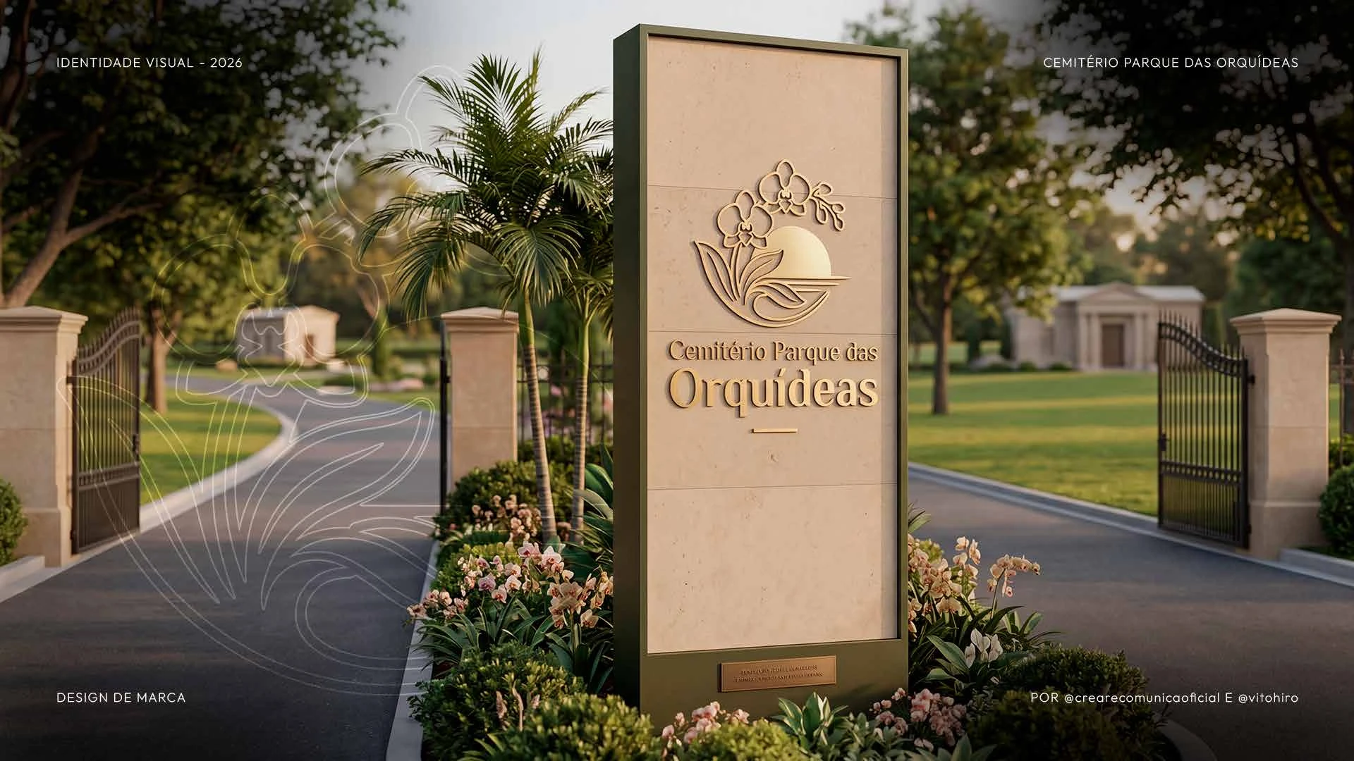
An identity ready for every touchpoint.